
Your website should shine through regardless of what platform your audience is using. Whether it’s mobile, iPad, desktop, laptop or desktop, your visitors should be able to see every content of your website in a way that’s clear, concise, interactive, and most importantly, worth their time.
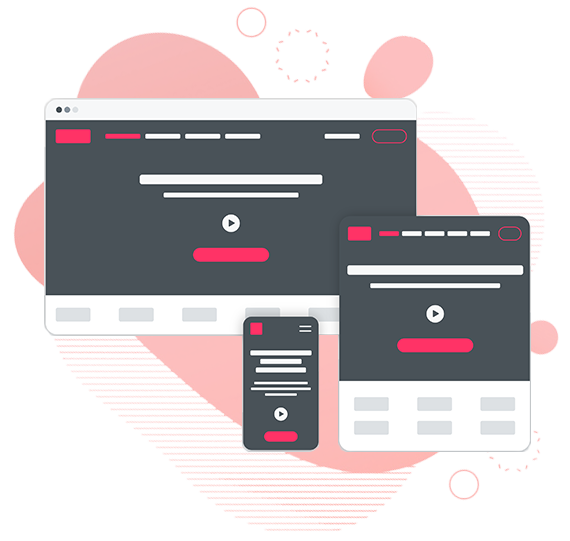
A responsive website design is therefore in most demand in this world, and our designers therefore have a responsive-first mindset.
Responsive-first mindset is a mindset that we have developed after rigorous research in the type of platforms that audience use to see a website. In our research, we have found out that:
Thus, when designing your website, we keep mobile users in mind. As a result of that mindset:
Courtesy of the above two factors, you’ll be able to get more traffic and thus, more business opportunities.
Each year, over hundreds of new mobile devices are launching each with their own technological rise. It has caused even the mobile responsive websites to diversity. You now have to have a different design for a black berry, different design for android and different design for an iPhone. Furthermore, the varying screen resolutions makes it necessary for the designs to be extra fluid.
So, how do we take care of the two factors of responsive-first mindset?
Bootstrapping and other such tools have allowed us to tap into the limitless potential of designing. However, through our own customized approach, we can almost foresee that new designs that are about to arrive.
That allows us to create flexible grids and layouts that can fit every interface of the website, on every type of platform.
So, if fluidity is what you’re looking for, our responsive website designs are here for you.