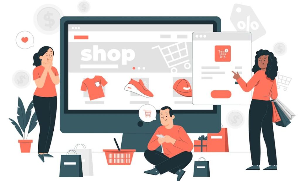
Web Design Tips to Avoid a Slowdown in E-Commerce Sales
Did you know that there will be 2.14 billion digital shoppers worldwide in 2021?
The sudden increase in the number of online shoppers due to the pandemic has undoubtedly brought about massive changes in the ecommerce sector. Websites are undoubtedly the new store front. These E-commerce stores help in overall increase in sales and revenue. However, designing an eCommerce website is not as easy as it seems. There are several disadvantages that can cost businesses customers and revenue. For this, you need to recruit the best E-commerce website design company India.
Although here we discussed Web Design Tips To Avoid a Slowdown in E-Commerce Sales. Also we provide some E-commerce website design tips that will help you a lot to improve. So without any further ado let’s jump into this article to know more about it.
Poor navigation
Good navigation is essential to creating a positive website user experience. If users can’t find what they’re looking for, they may leave frustrated – because the website didn’t help them find the right page. More broadly, a common navigation problem in some large stores is showing the customer too many options. When the user is presented with dozens of product categories, it can be difficult to know where to start (known as ‘choice overload’). Therefore, it is often a good idea to limit the number of options initially presented to the user.
A ‘smart’ search box can be a great addition to any e-commerce website. It can be worth investing in a smart system capable of accounting for misspellings, assumed user intent, relevance, and more.
Incompatibility with mobile devices
According to Statistics, more than half of the world’s (52%) web traffic now occurs on mobile devices. The growing number of iOS and Android devices means that eCommerce websites need to be compatible with different platforms and devices. If your site is not able to load on mobile, you will lose a lot of clients and sales.
Some common mobile device design pitfalls include:
- Sometimes design elements that look fine on a desktop computer can be cluttered or misaligned on a small screen
- Clickable elements are too small or too close together, making it difficult to tap the correct links and buttons correctly.
As a result, developers need to focus on the user experience and user interface of ecommerce stores. There is also an SEO incentive to ensure your mobile site is high-quality. Moreover, you need to make sure that the site looks perfect on both small and long screens. The site must maintain the same functionality and clean look on mobile that it offers on your desktop site. Additionally, it makes sense to consider whether any part of the ordering process can be streamlined for smaller screens.
Fortunately, Google has provided an automated tool called the Mobile-Friendly Checker. This tool allows you to enter your website URL and quickly find out if there are any major usability issues for users on small screens.
Slow loading times
Slow page loading times can be poison for sales. Many customers don’t know exactly what they want to buy and want to browse around. If they have to wait for a succession of slow pages, the whole process can be hampered and cause frustration.
Page speed can also have a big impact on your store’s search engine optimization (SEO). Google uses loading time as one of many factors to determine ranking order on its search results pages.
Google even says that according to their research, 53% of mobile phone users will leave a site that takes just over three seconds to load. To avoid slow loading times, try to maintain a minimalistic theme by avoiding bunch of interactive graphics. Instead, use high-quality JPG images, they’re fine for the web.
No social proof
If you think social media marketing is only for big businesses with deep pockets, then you are wrong. There are plenty of ways to use it to promote your small business. A common approach – favored by e-commerce giants like Amazon and eBay – is to include user reviews and testimonials on product pages. You can also add a section in your design for ‘hot’ or ‘trending’ items, which shows that a lot of people are buying them (and triggers the fear of losing out).
If you’re not actively participating in social media to build trust with customers, you’re leaving money behind. When you don’t make it easy for customers to find you online, you’re losing potential revenue. Additionally, make sure your website is optimized for search engines because over 90% of sales start with a search.
Lack of product description
Product description is the only way you can reach consumers is through text, images and video. That’s why you have to give focus on detailed product description. It must be accurate, concise and informative. If you give vague descriptions that don’t really offer any help, you’ll lose customers. Moreover, you need to highlight the beneficial aspects and USP of the product in the description section.
Conclusion
Overall these are the Web Design Tips to Avoid a Slowdown in E-Commerce Sales. It is important that you consider these mistakes and not repeat them. After all, a financial loss or customer churn can have a devastating impact on a business.
Also read about How UI/UX Design Affect Your Website Impression